
One platform, shouting equally loud about everything.
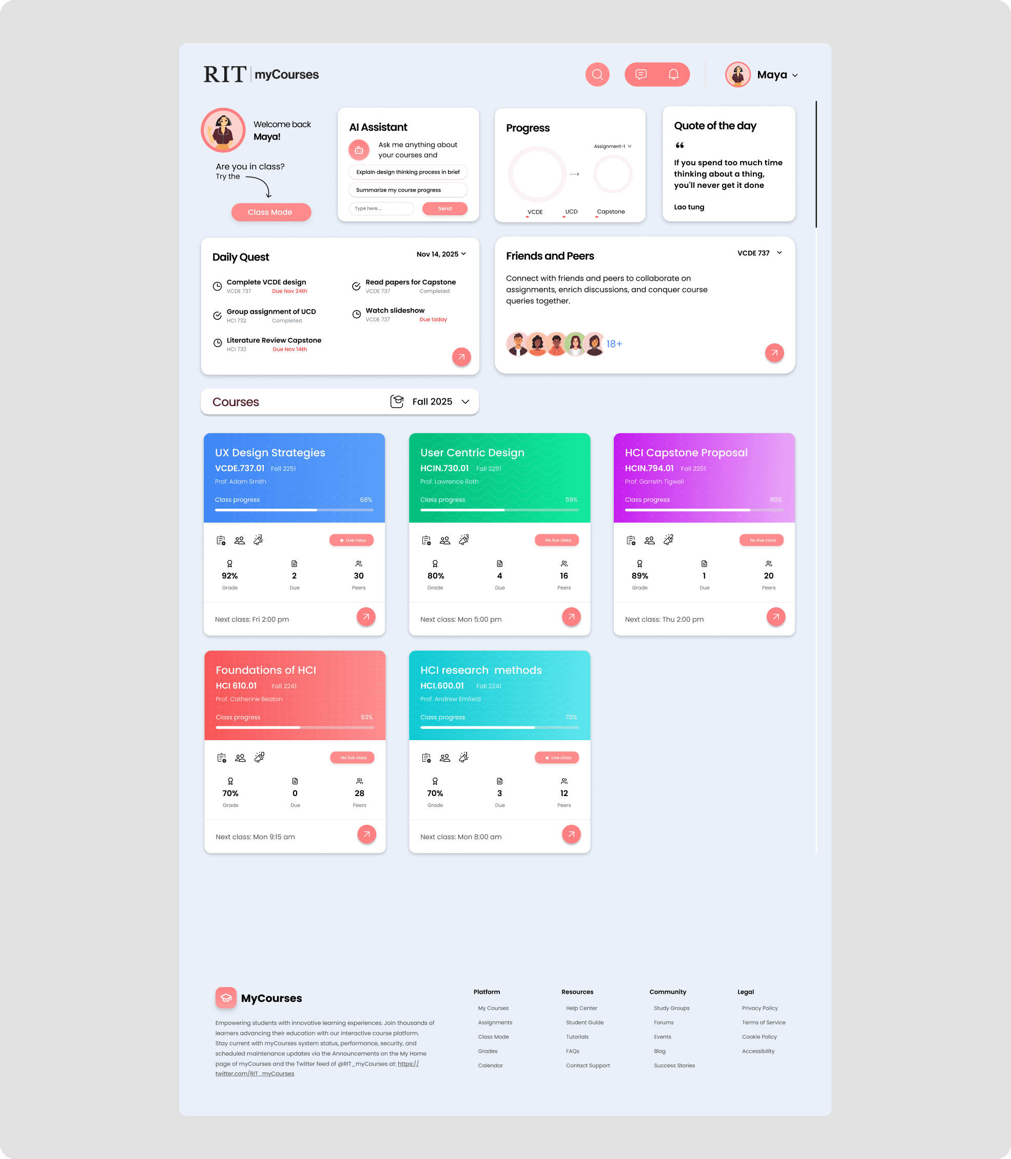
MyCourses is the academic backbone of RIT — yet students hit stress, confusion, and friction when using it to manage assignments, deadlines, and collaboration. The interface gives a parking notice and a final-project deadline the same weight, so the things that matter slip through the cracks.
Rather than redesign the entire system, I focused on the moments that matter most: checking what's due, submitting with confidence, and collaborating without leaving the platform. When I mapped what students ran into, four problems kept surfacing:
Students weren't failing the work. They were failing to trust the system.
I ran a survey of 15 students alongside interviews and affinity mapping. Two findings reframed the whole project:
The pattern underneath both numbers was submission anxiety — a quiet, constant tax on every student. When I asked what frustrated them most about submitting, one answer dominated:
Design around intent, not features.
Instead of adding complexity, I structured the experience around what a student is actually trying to do when they open MyCourses. It's almost always one of three things — so every decision had to serve one of them with minimal friction.
Check what's due
See the real workload at a glance — what's due, what's in progress, what's done.
Submit with confidence
Upload, preview, confirm — and never wonder whether it actually went through.
Coordinate with others
Discuss, share drafts, and give feedback without leaving the platform.
Three moves that turn a repository into a workspace.
What's due, in one calm view.
Rather than scattering assignments across courses and tabs, a single view shows everything at a glance — so students understand their workload without digging through pages.
- What's due, in progress, and already submitted
- Deadlines surfaced by urgency, not buried
- A calendar that makes the week legible

Turning submission into a reassuring moment.
Students were anxious after submitting because they were never fully sure it went through. The redesign makes every step legible and reversible.
- File preview before you commit
- Clear confirmation with a timestamp
- Undo within 5 seconds, and easy file replacement

Coordination, built into the flow.
Group chats, shared files, and feedback designed directly into the assignment flow — instead of switching to WhatsApp, email, or Google Docs, it all lives where the work does.
- Discuss assignments with classmates
- Share drafts and leave feedback
- Find peers in the same course

See the flow in motion.
A walkthrough of the redesigned experience — from opening the hub to submitting with confidence.
From a passive repository to an active workspace.
The redesigned MyCourses reduces uncertainty around deadlines, eliminates guesswork during submissions, and supports collaboration without fragmentation — all in one calm, legible home.
Reflection
Good design isn't about making systems more powerful. It's about making them feel more understandable — keeping the user in mind and designing so even a complex platform like an LMS can feel calm and supportive.