
I knew the laws. I just couldn't keep them apart.
After three years in UX, I still mixed them up. Fitts, Hick, Jakob, Von Restorff, serial position, Gestalt. Each one describes something true about how people think, but together they blur into one list of names.
I had read the articles and saved the cheat sheets. None of it stuck. I doubt I am the only designer quietly in this spot.
You don't learn a feeling from a flashcard.
These principles are not facts to memorize. They are feelings about how people behave: the pull of things placed close together, the strain of a tiny button, the effort of reading gray text on cream.
You learn a feeling by doing it. So Design Playground teaches each law through a short game where you produce the principle yourself, and the moment you get it right, it names the law you just used.
Make the principle happen first, and name it second. The name lands on a feeling you already have, so it has something to hold on to.
"Fitts's Law: the time to reach a target depends on its size and distance." You nod, and you forget.
You chase a shrinking button, feel the miss, and then see the words Fitts's Law. Now the name means something.
Three games, and the aha arrives on cue.
The first season has three games, each about two or three minutes long. The launch film gives the whole idea in 20 seconds.
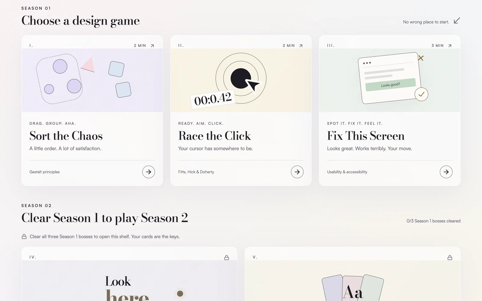
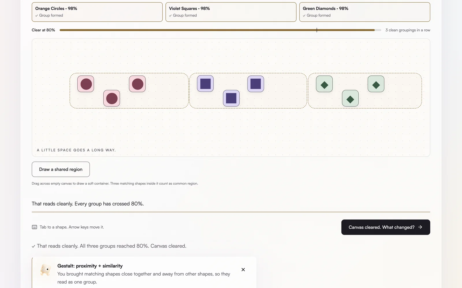
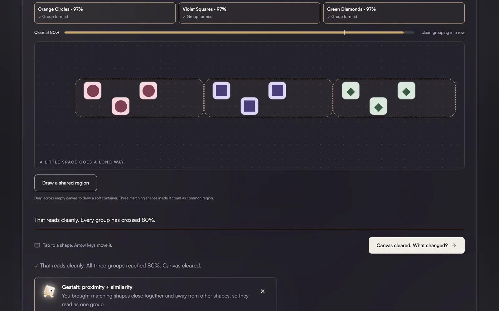
Sort the Chaos (Gestalt). Nine scattered shapes, three kinds. You drag them into groups, and a clarity meter climbs as like shapes come together and other groups get room. Past 80%, the canvas clears and the app names what you just did: proximity and similarity.
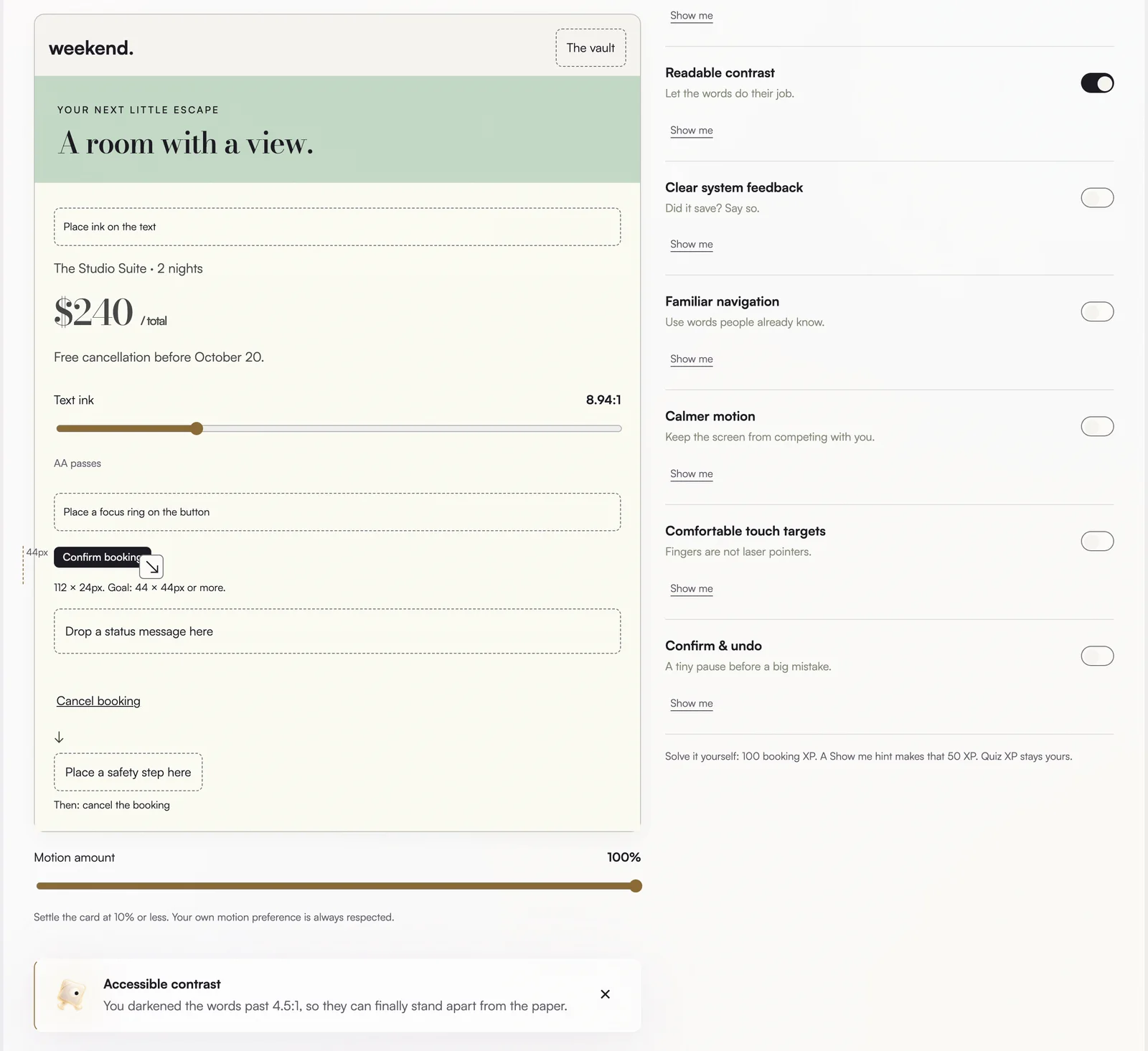
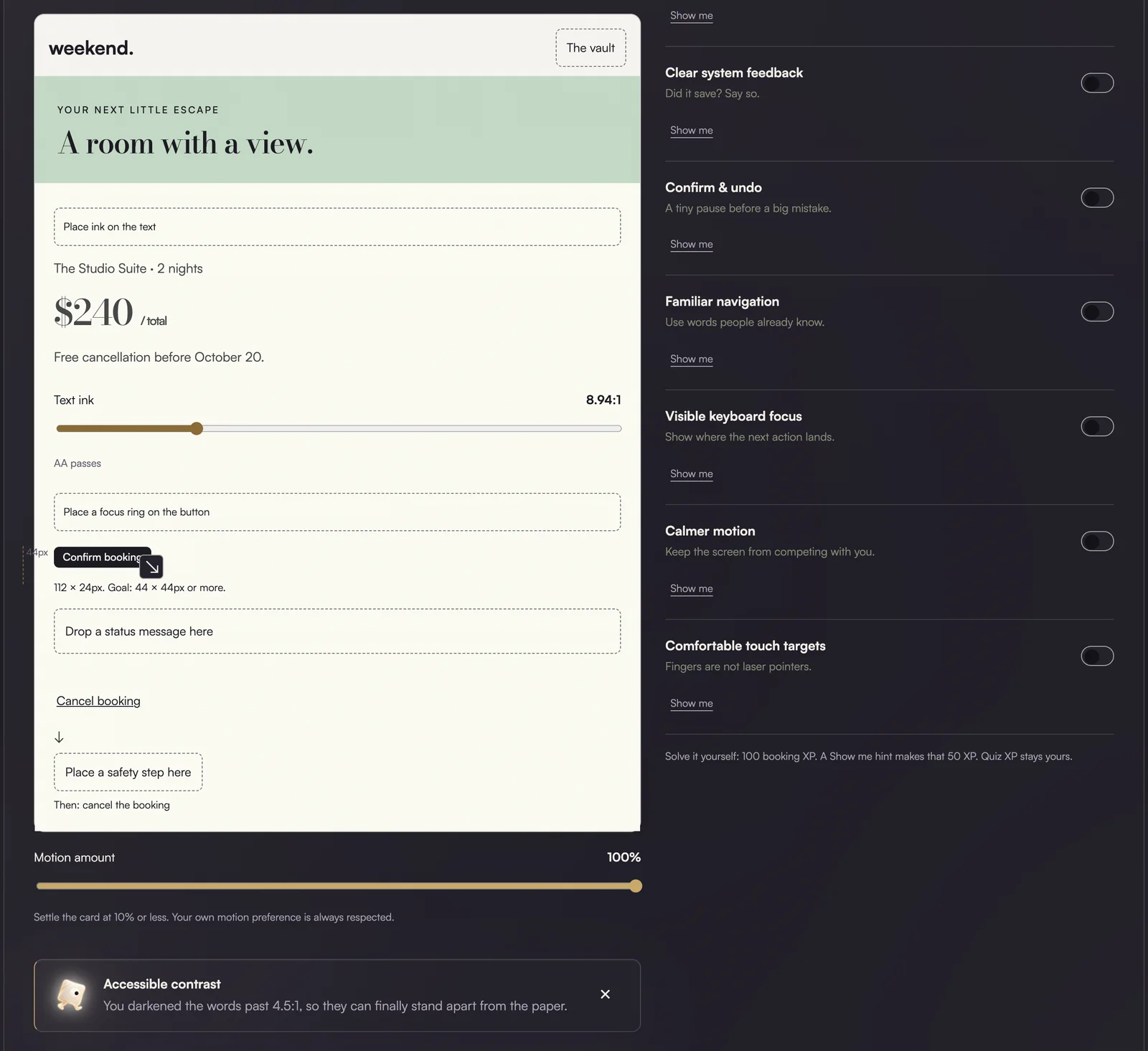
Fix This Screen (usability and accessibility). A pretty booking screen that works badly. You repair seven problems by hand. Drag darker ink onto faded text and watch the contrast ratio climb past 4.5:1. Drag a 24px button out to a comfortable 44px. Drop in a status message, a confirmation step, calmer motion.
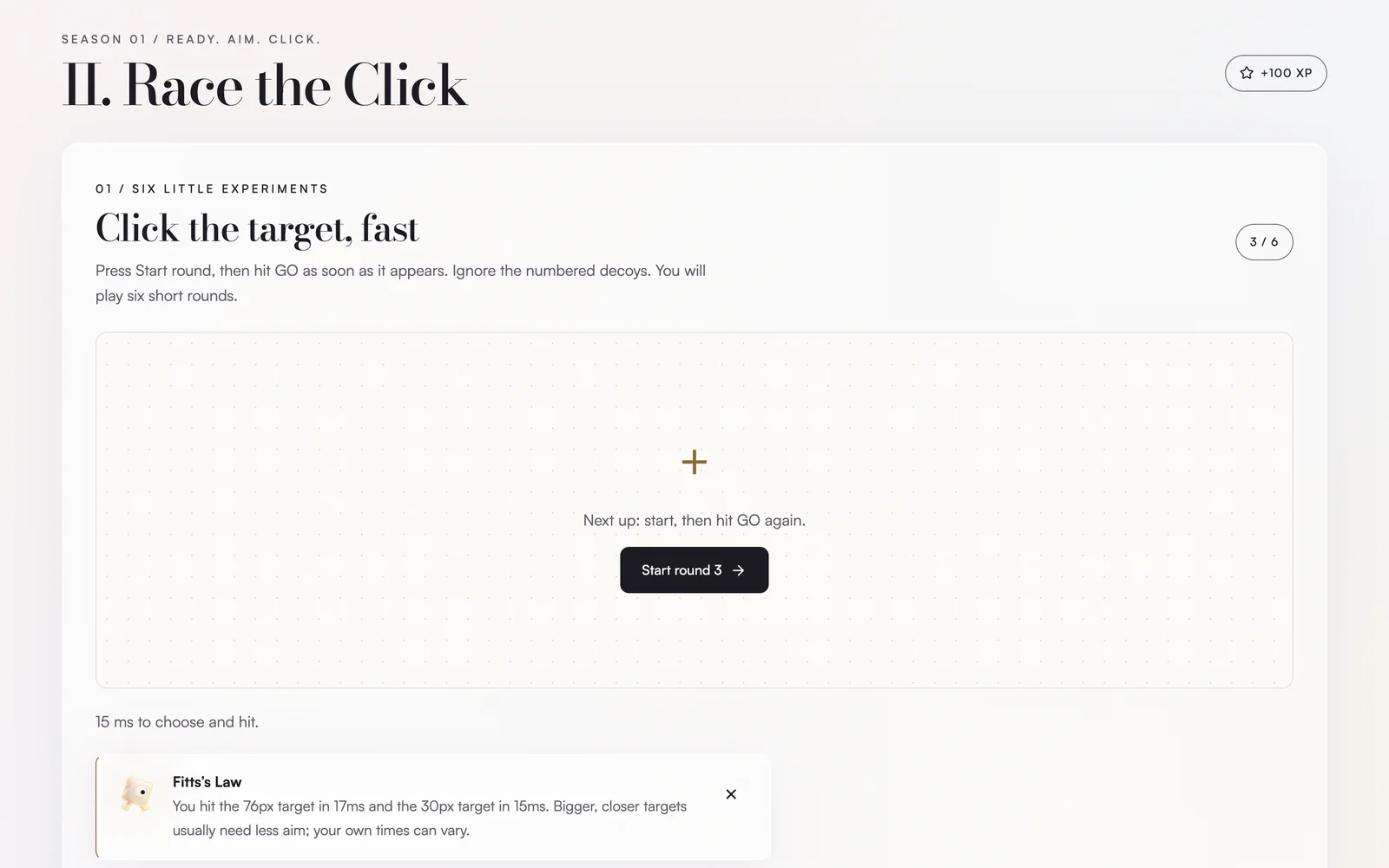
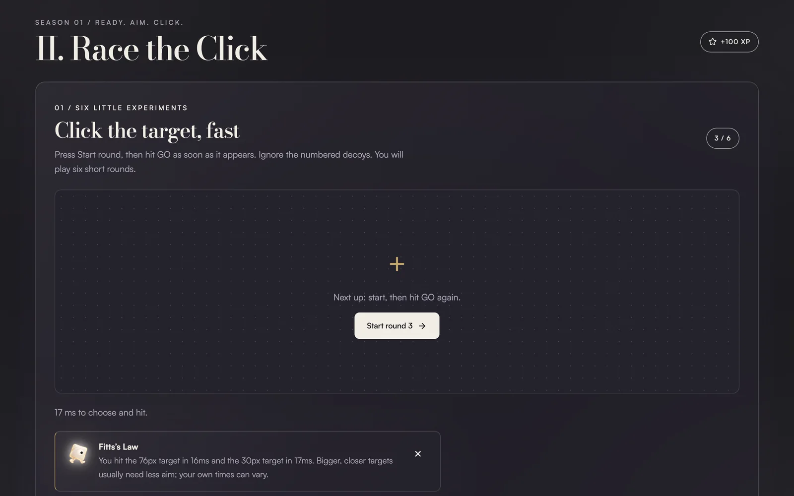
Race the Click (Fitts, Hick and Doherty). Six short rounds against the clock: hit GO as it appears, with targets that shrink and decoys that crowd in. After a few rounds, the app shows your own times next to each other, so Fitts's Law arrives as your own data.
Around the games sits a light layer that gives people a reason to come back:
Every law you perform becomes a card in your deck, so collecting all fifteen means having felt all fifteen. The sandbox is free play with type, color and spacing. A second season of four more games stays locked until you clear the first three. There is also a little personalization (your first name, a time-of-day greeting) and a day and night theme.
Recognition is not learning.
Four decisions shaped the product more than any single screen.
1. I rebuilt the core interaction from passive to active. The first version of Fix This Screen let you fix the screen by flipping toggles. It looked like progress, but nobody learned anything, because the app did the work. So I rebuilt it so you do the fix with your own hands: drag, resize, rewrite. The toggles still exist, but only as a checklist that turns on when you have actually done the repair.
Flip a switch
Tap "readable contrast", and the text darkens for you. Fast and tidy, and it teaches nothing.
Do the fix yourselfchosen
Drag the ink, resize the button, write the message. The switch only confirms what you did.
2. It practices what it teaches. A game about accessibility has to be accessible. Every game is fully playable by keyboard, with visible focus: in Sort the Chaos you tab to a shape and move it with the arrow keys. Motion respects reduced-motion settings, and the text passes WCAG AA contrast. I checked all of this before launch.
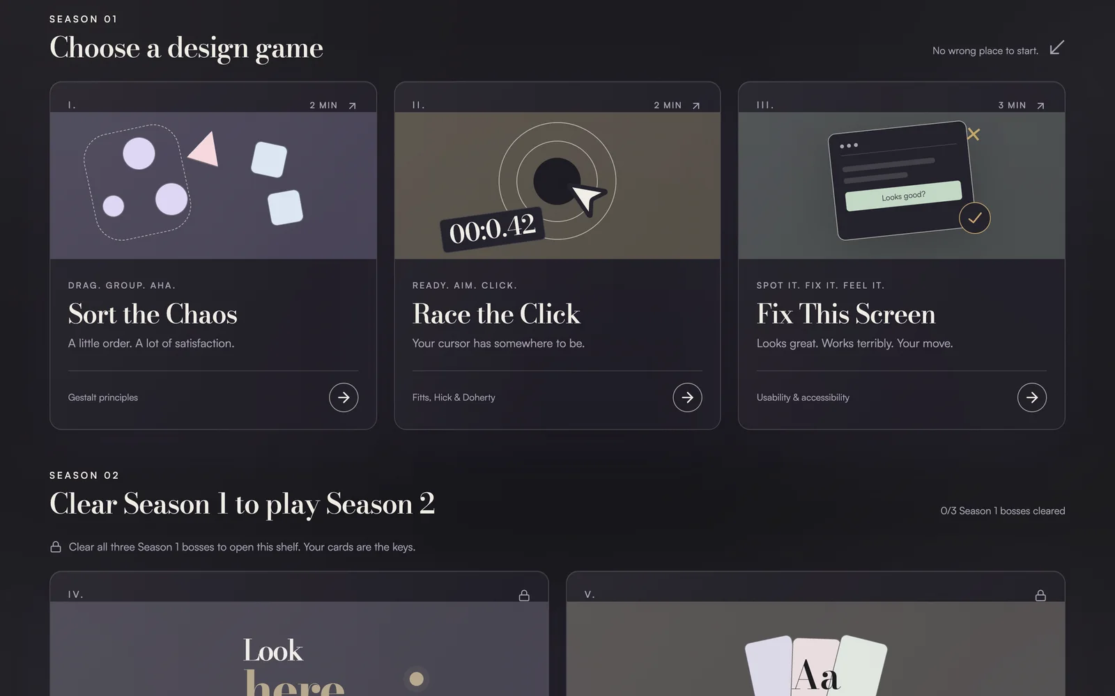
3. A visual identity that feels premium, not like homework. I went with an editorial "luxury typography" direction: an expressive serif display, a pearl and ink palette, a single gold accent, and generous whitespace. A learning tool usually looks like a learning tool. This one is meant to feel like something you would choose to open.
4. Editing is part of taste. I explored a dramatic dark-blue aurora direction too. It was striking, and it fought the design, pulling attention away from the games. I cut it.
Dark-blue aurora
A moody gradient world. Striking on its own, but it competed with the games for attention.
Luxury typographychosen
Serif display, pearl and ink, one gold accent, lots of space. Quiet enough to let the games lead.
From an idea to a live app.
Design Playground is a React web app. Motion runs through the existing animation library and respects reduced motion, and your progress is saved locally in the browser, with no account needed.
A personal project. I drove it end to end: concept, UX, interaction design, visual direction, and copywriting, through design critique, rebuilds, an accessibility pass, and launch. I built it iteratively with ChatGPT / Codex as a pair: I set the direction and judged every version, and the AI helped me write the code.
What building it taught me
The fastest way to make an idea stick is to let someone produce it before you name it. That turned out to be true for the people playing, and for me while I was building it.